What colors say Psychology, meaning and perception of color
If you want to know the inner world of a person, look into his room. Expressiveness, pedantic accuracy, laziness, confidence, modesty or greed - all this and a little more will tell the chosen color palette.
Red is a color that encourages action, dominance and leadership. This shade in the interior is chosen by passionate and reckless people, it is contraindicated for people with an unstable psyche. In the interior in its purest form, the use of red is quite burdensome, therefore, to create an organic design, a skilled hand of the master is required.
Red decor elements will not overload the interior
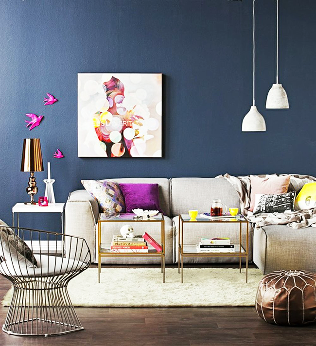
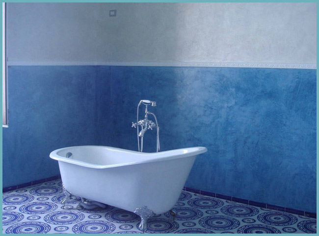
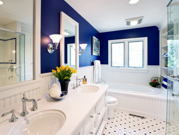
Shades of blue soothe, relax and allow you to concentrate. Blue, turquoise tones and the color of the sea wave create a feeling of carelessness, lightness and mischief.
The combination of shades of blue in the interior gives a warm atmosphere
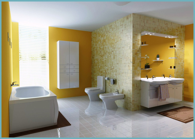
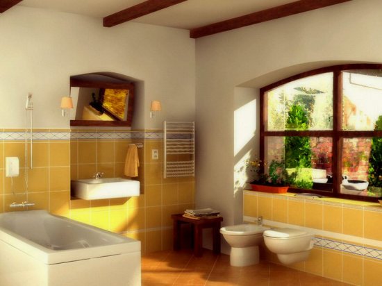
The prevailing yellow colors speak of the energy, sunshine and cheerfulness of the person. At the same time, the lack of creative flight and unrealized potential are also characteristic of this color. Some psychologists attribute even jealousy and cowardice to yellow, but this is a controversial statement.

Mustard yellow tones make the interior more restrained
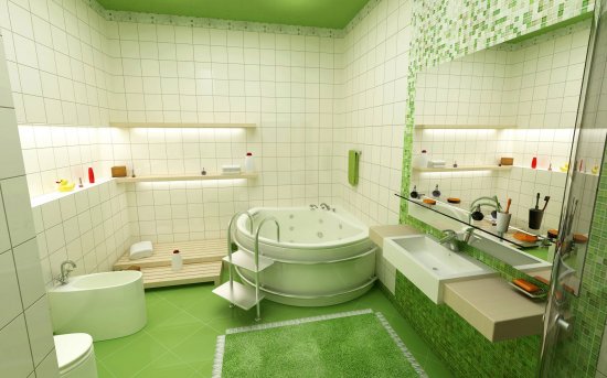
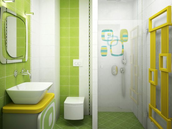
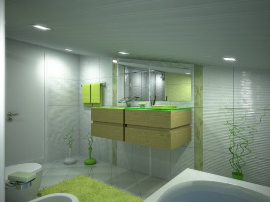
The combination of blue and yellow creates a derived green color inherent in people of conservative views. Green is an anti-stress color. It is advantageously used in bedrooms or living rooms to create a relaxing atmosphere.
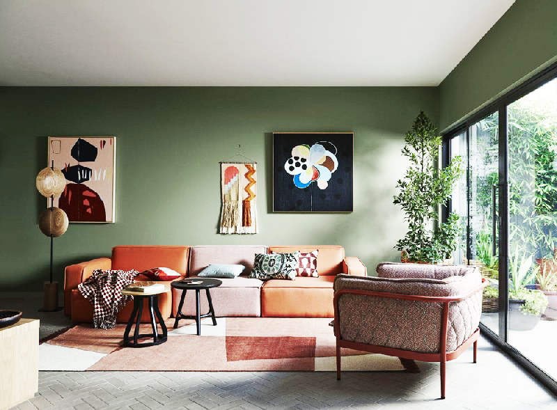
A winning combination of green and red
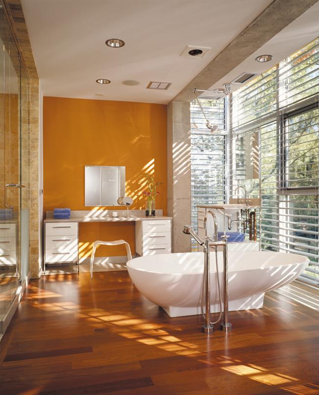
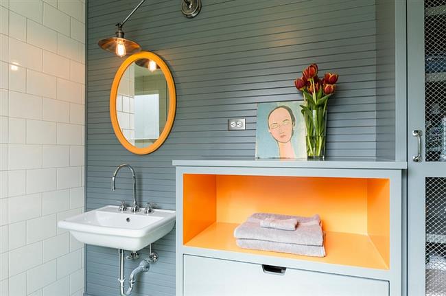
Orange color without impurities is energy, its indomitable fountain. Rich ocher and delicate apricot are accents in the room, so they are most often presented in the form of original textiles and accessories.
Care must be taken when using orange, as its shades have a dominant effect on other colors.

The perfect trio of juicy shades: orange, green and red

Living room in retro style with soft colors
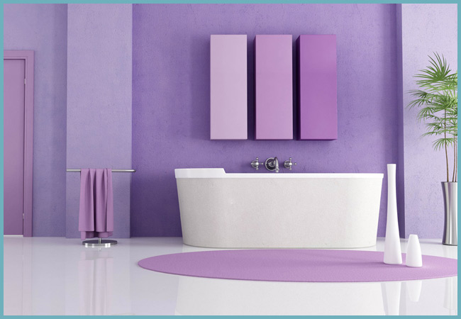
Purple is considered the color of the creative soul. Possessing a mystical appeal, it simultaneously conveys the coldness of blue scales and the radiation of warm tones. Contrasting combinations "purple - lime" or "purple - yellow" are the favorite combinations of many designers.

A touch of grape hue in a calm neutral bedroom
Pink color is the personification of romance and tenderness for women of all ages. The harmony of pink accents directly depends on their saturation (from Barbie syndrome to mature classics). Diluting pink with milky, gray and gray-green motifs, you can emphasize the sophistication and airiness of the interior.

Romantic image of the bedroom in white and pink colors
Magenta color accents in a stylish living room
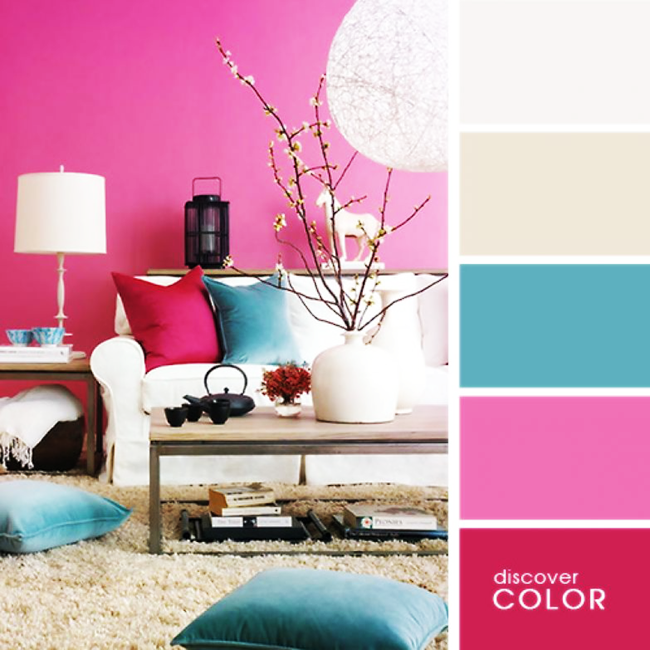
Bright fuchsia combined with turquoise - a "classic" bright combination
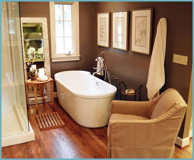
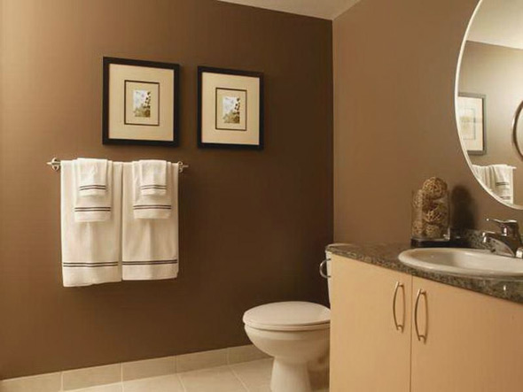
Brown color is classified as melancholy undeservedly. In combination with dark tones and golden blotches, it creates royal chic and privilege. Brown is chosen by versatile personalities.

Home workshop in the dark
Brown palette in the design of the hallway in modern style
Gray, due to its neutrality, is an excellent magnet, taking on the aggression of a brighter tone. As an independent monochromatic finish, it can be quite boring, depending, of course, on the functional purpose of the room. Gray tones are preferred by people striving for understanding and constancy.
Neutral gray color can be diluted with any shade

Certain colors in the room will adjust to the desired mood

Particular attention when decorating the room should be given to the choice of shades.
The main characteristics and combinations of popular colors and shades by interior styles
Many people like it when there is a certain style direction in the apartment. The bathroom can be designed according to the overall design or its territory will be different
Particular attention should be paid to the fact that the color schemes for the bathroom, in this case, are consistent with the style:
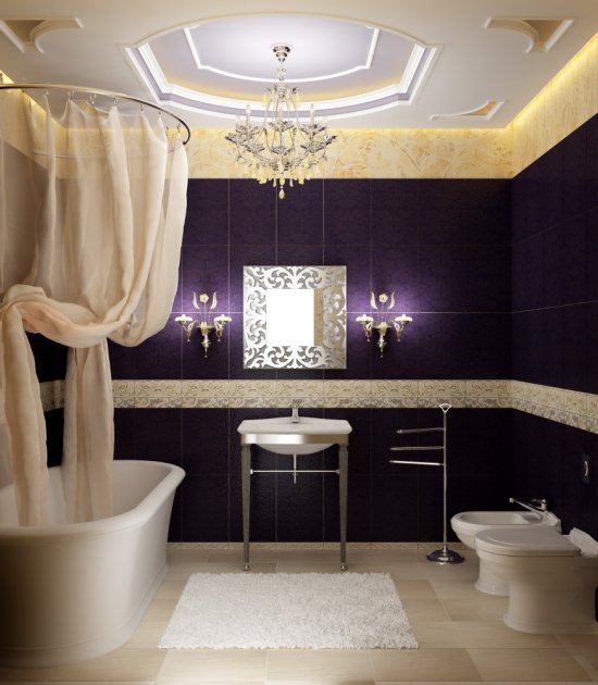
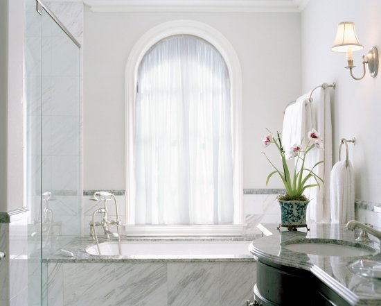
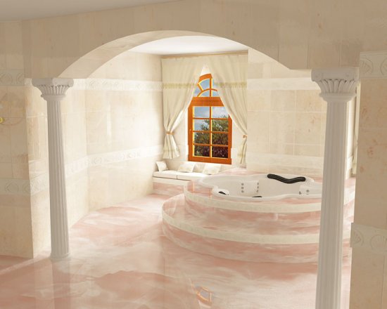
- Classicism reflects refined and discreet luxury. It is characterized by the presence of noble shades. It is white, gold and blue. Often resort to pastel soft colors.
- Modern for the bathroom is one of the most acceptable styles. The emphasis is on functionality and comfort. Inconspicuous tones are welcome: coffee, beige, milky. There is no place for sharp and flashy color combinations in this style.
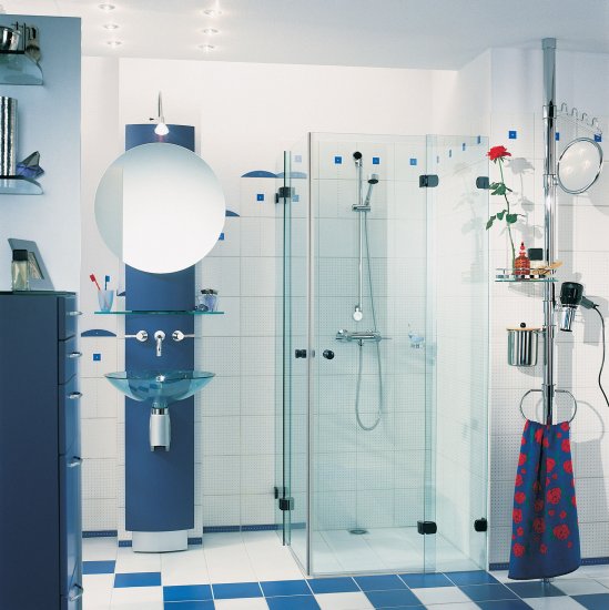
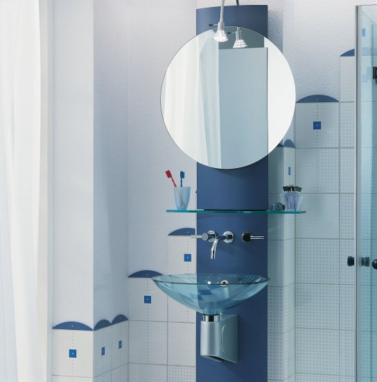
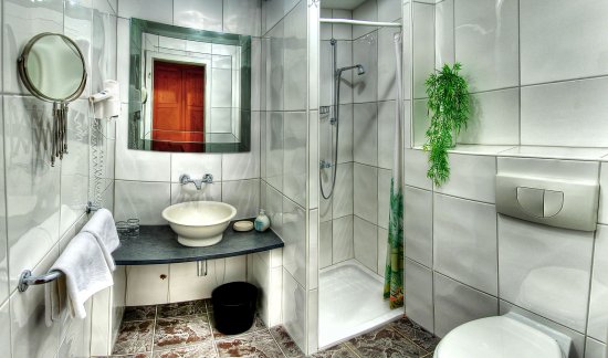
- The avant-garde prefers contrasts. In the interior of the bathroom, the colors of the vertical and horizontal planes differ from each other. To combine colors in the bathroom in this style, it is appropriate to use a combination of pure shades: white with green, black, red or yellow.
- Hi-tech contributes to the creation of a color scheme with discreet and discreet colors: black, gray, silver, white. A peculiar highlight is the introduction of bright colors in a small amount. It could be bathroom accessories.
Bathroom in avant-garde style.
The meaning of color in the interior, its psychological perception
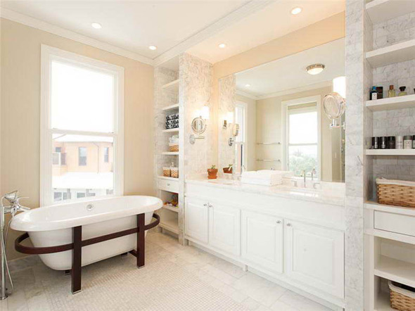
White
On the one hand, it is a pure classic, and on the other hand, it may seem simple, cold. But it is worth remembering that there are many: pearl, milky, ivory, smoky, etc. And if you work on their combination, then the white interior will look great both in a spacious bathroom and in a small room. White color is universal, it is combined with any other colors and shades.
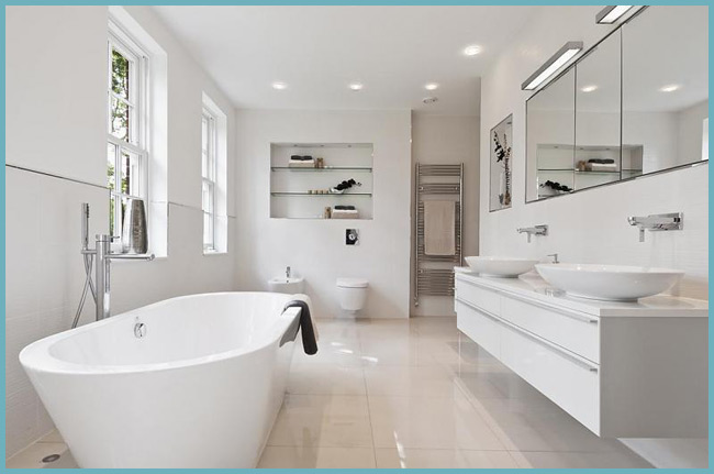
White color in the bathroom creates a feeling of purity and harmony.
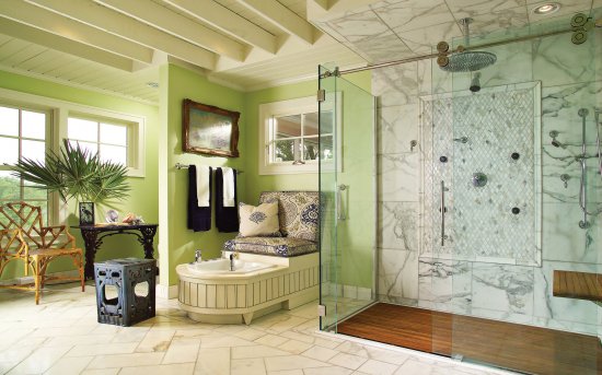
Green
The positive influence of green is recognized by all psychologists in the world. As a rule, it is used to create lively, fresh and individual interiors. Green color has a calming effect, and at the same time, in combination with other colors, it gives a positive emotional mood. Perfectly harmonizes with white, orange and yellow.
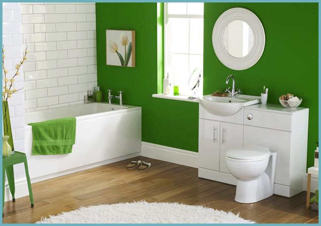
Green color is able to balance the psychological state of a person
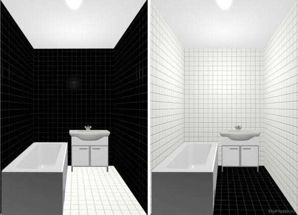
Black
Not in high demand
You can use it only in spacious rooms and very carefully, because excessive blackness will negatively affect the mental state of a person. For those who do not like the classic, black can be combined with gray, gold, peach
It looks very expressive with red or yellow.
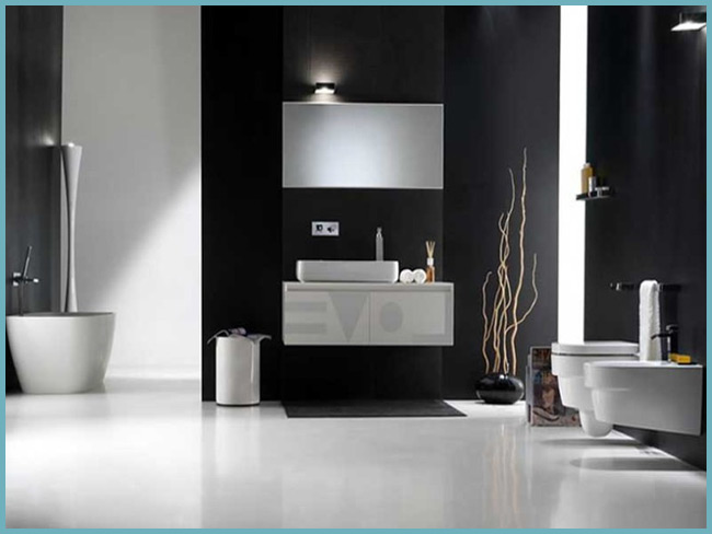
Black color makes the interior luxurious and strict
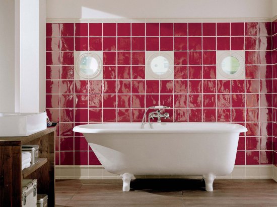
Red
In combination with other shades, it always takes on a dominant role. It activates, invigorates and excites, and therefore is completely unsuitable for creating an oasis of relaxation and peace in the bathroom. The most successful red color will be in a room where there is no shortage of space. You can combine it with white, gray or orange.
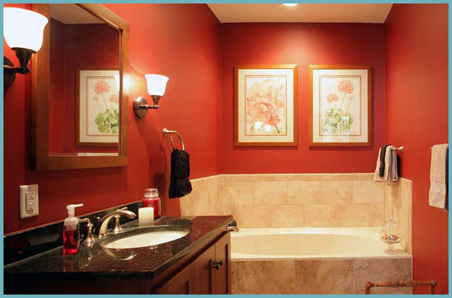
The red color of the interior excites and invigorates
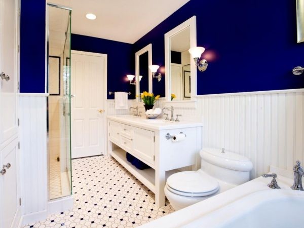
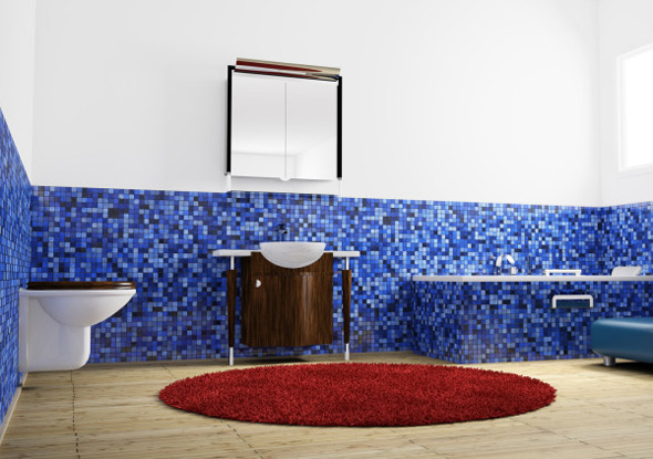
Blue
It seems cold and uncomfortable to many, but in fact it is great for the bathroom interior. The main thing is to choose the right accompanying warm tones. You can combine it with white, orange, beige. Wood and other natural materials fit perfectly into the blue interior.
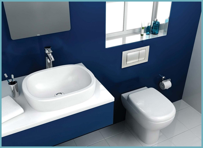
Blue makes the bathroom "cooler"
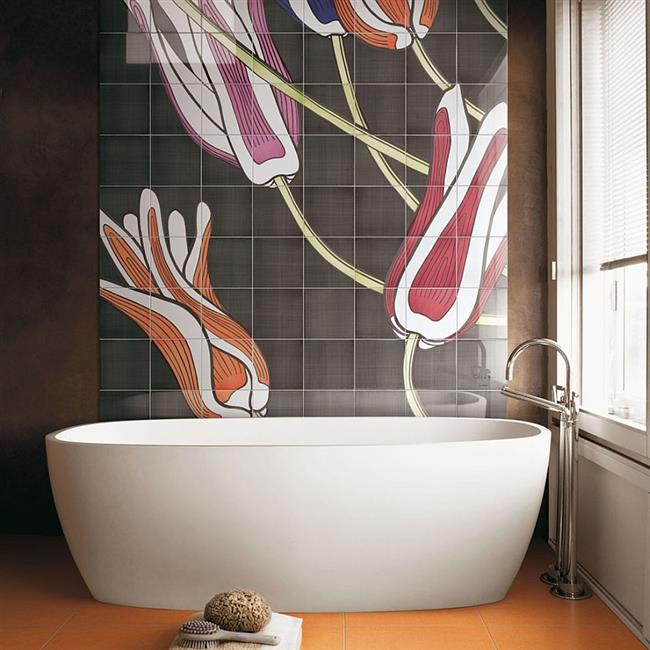
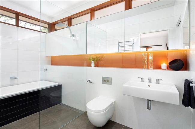
Orange
It's no surprise that warm and cozy orange is often chosen for bathrooms. In small rooms, light peach looks better, and in more spacious, more saturated, deep tones will be appropriate. You can combine orange with white, green, gray, cream or blue.
Orange color adds coziness to the interior
Yellow
Warmth and energy, but such a bright environment in the bathroom is not for everyone.A positive color will be a great addition to other shades, but it is rarely used as the main background.
Yellow color will bring "sunshine" to the interior
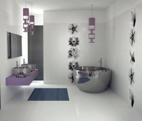
Purple and its shades
Light shades of purple look very gentle and calm in the interior, perfect for small rooms. Such an environment will not be too tiring or emotional. The larger the area of the bathroom, the deeper and brighter shades can be used. If we talk about combinations, then all shades of purple are harmoniously combined with each other, they can be supplemented with green, yellow or white.
Shades of purple make the interior expressive
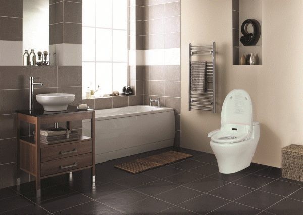
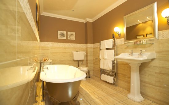
Brown
Brown is warm and cozy, goes well with all related shades and white. But in view of the abundance of other possible options, brown interiors are becoming rarer.
The interior in chocolate tones looks noble and unusual.
Bathroom wall painting techniques
Painting the walls in the bathroom rarely involves one shade, which means that when choosing the main colors, you should also think about how they will be combined in the interior.
The horizontal separation of two colors can be even arcuate, wavy, etc. The border can be decorated with other materials: planks, slats, moldings, mosaics.
Horizontal color separation in the bathroom
Color inserts. The walls are painted with the main color, and after drying, any decorative elements are performed, these can be geometric shapes, horizontal and vertical stripes, a pattern or pattern.
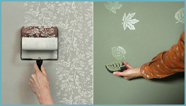
Applying a pattern with a texture roller (left) and a stamp (right)
Advice! Very interesting and original interiors will help to create stencils with various ornamental or natural patterns.
accent wall. Three walls in the bathroom are painted in a neutral shade, and the fourth is accentuated using a deeper color.
Accent wall in the bathroom
Niches, ledges, openings are painted in a darker color or any contrasting one.
And the last moment, when choosing a color, ask yourself one question, “Will I get tired of this color in a month or two”, because changing the color in the bathroom is oh so difficult.
The combination of colors in the interior combinatorics
In order to avoid visual overwork or, conversely, boring monotony, the selection of colors should take into account three main types of combination - uniformity, contrast, balance. The range of colors in the first case is reduced to one color with fluctuations in light and dark tones. As a rule, a monochromatic finish is diluted with decorative elements of one or two colors.
In contrast reception, the principle of antipodes is used. Contrasting dark shades with light ones, you can achieve an original bright tandem. For example: white - black, purple - light green, chocolate - golden and so on.
In an effort to maintain balance, one of the pure colors should dominate the interior with the visual support of related tones. To avoid visual saturation, it is recommended not to use more than five colors.

A table that helps to distinguish between cold and warm shades
Important! With red, it is appropriate to use its light derivatives - orange and yellow. With dark variations of red, lilac and pink are suitable.
If you want to give the interior a special elegance, use small items that contrast with the main color.

Shade layout chart
feng shui color palette
Recently, many design based on the principles of oriental geomancy, in other words, choose the color and layout for the bathroom according to feng shui.
Interior feng shui rules involves painting the walls with natural colors
According to Taoist teachings, the bathroom is designed to cleanse a person from fatigue, stress and restore strength, so the walls here should not be very bright, and the ceiling should be left white and even.The best colors are pastel shades of green, blue, purple and white. Black, gray and brown are considered undesirable.
It is very important to make contrasting accents. These can be ornaments, borders or friezes on the walls, furnishings
For them, you can choose bright shades of yellow, red, green, blue or purple.
The combination of different colors in the bathroom
Black color
Black is a very stylish, concise and elegant color. For a good result, it must be used correctly and moderately in the interior of the bathroom. It should occupy no more than 50 percent of the space.
In addition to it, white is perfect. This combination is classic and win-win. It is suitable for both large rooms and small bathrooms.
The most daring and energetic option for extraordinary people is a combination of black and bright (red, yellow, blue) colors. The main rule is not to overdo it with a black tone so that the interior does not become gloomy and gloomy.
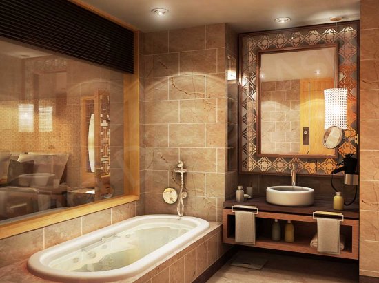
Brown color
Brown is the color of constancy and balance. It is a new trend in bathroom design. Brown is able to soothe, give the bath a cosiness and a feeling of lightness.
It goes well with any decorative styles, as well as bright and pastel colors. With the addition of blue and green hues, you can create the illusion of nature indoors. Dark chocolate and coffee tones will suit the intense light color. White in tandem with brown will make the situation in the bathroom sophisticated and sophisticated.
Purple
Purple is a mysterious, mysterious and romantic color that has a huge number of shades. A bath made in such colors can have a beneficial effect on human health.
The intensity of purple is directly proportional to the size of the area of the bathroom. In large baths, the deepest and darkest tones of this color can be used in large quantities. And in a small room, it is best to perform only one of the walls in saturated color. This will visually increase the depth of space.
Purple furniture with smooth lines, against the background of light walls, will give the room a special charm.
The best companions for a purple interior are blue, white, gray and gold. A successful experiment will be a combination of yellow and dark purple.
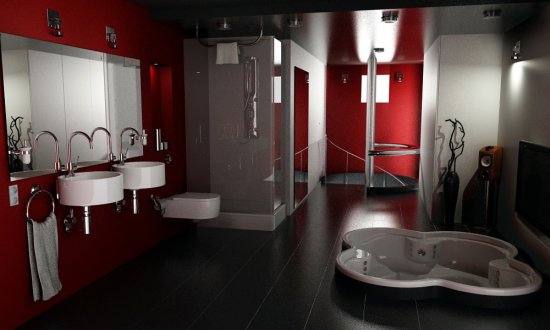
Red color
Red is a provocative, energetic and dynamic color.
Use it in the interior of the bathroom (like black) you need to be very careful and in limited quantities.
Most often, in addition to it, there is a white or light beige color.
The introduction of black decor elements will give the bathroom sophistication and bring the space to a high level.
Grey colour
A very fashionable solution today is a combination of bright and gray colors in the bathroom. This universal color successfully sets off light interior items.
Green in combination with gray is a tandem created by nature. This duet perfectly calms and charges with positive.
In bathrooms of small sizes, gray furniture will look beautiful against the background of walls of delicate yellow and salad shades.
Wet asphalt walls, complete with orange-colored interior elements, are the perfect solution for windowless bathrooms.
The bathroom is the place where a person starts and ends his day. Properly chosen style, design and color of the interior is the key to a successful, energetic and cheerful day.
Move away from the usual standards, show your imagination, and turn your bathroom into a luxurious and stylish room in the house to surprise guests and loved ones.
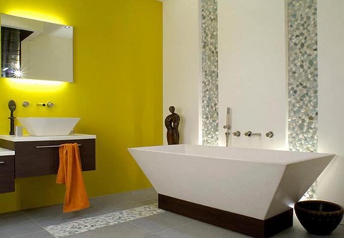
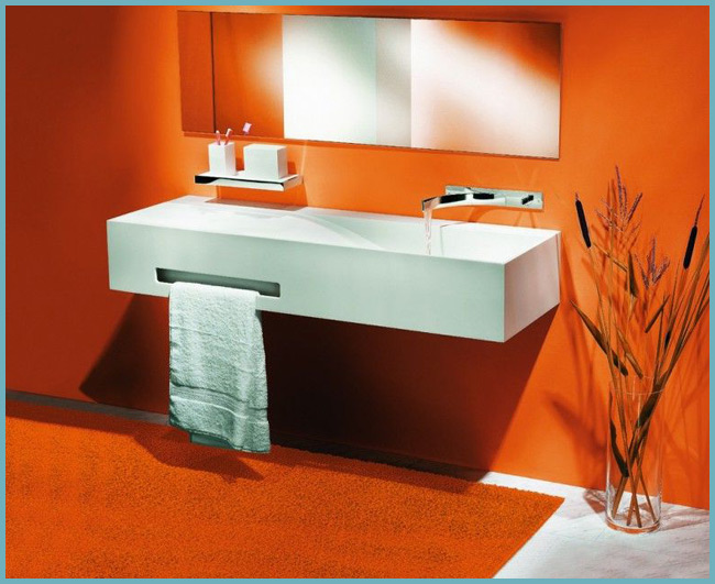
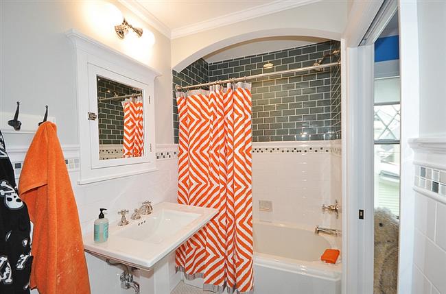
Stylish and bright orange bathrooms
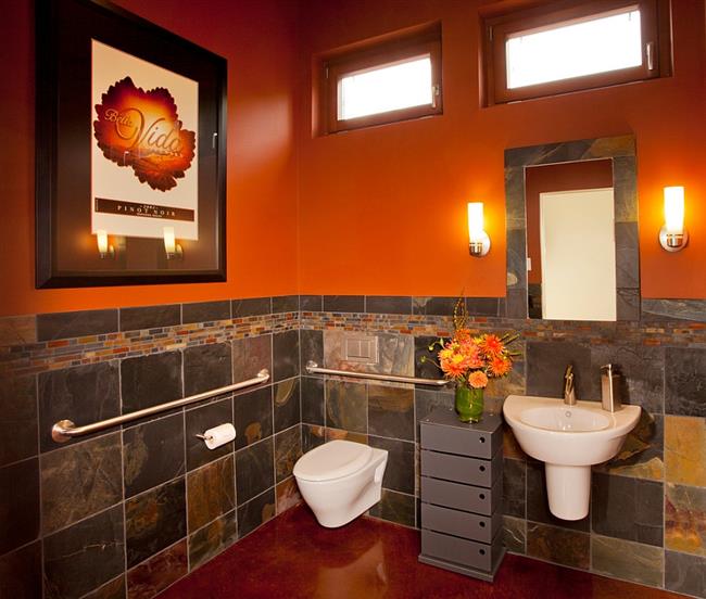
Orange is one of the most active warm colors that combines the depth of red with the energy of sunny yellow.Orange symbolizes the sunset, carelessness and pleasure, this color creates an atmosphere of celebration, fun and happiness in the interior of the house, filling the rooms with sunny warmth even in the cold winter. However, like other bright colors, orange must be used wisely and in a balanced way so as not to overload the room with excessive energy of this orange color. So, in the photo below we see a stylish rustic bathroom, the designers used bright orange paint for the walls, and the room is complemented by stylish orange lamps from Studio 80 Interior Design.
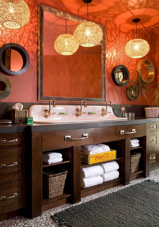
Bathroom in orange.
To liven up the austere industrial-style bathroom interior, Thomas Roszak Architecture used bright tones of orange.
Orange bathroom in industrial style.
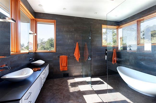
Orange color has a large number of shades: from defiant to delicate apricot and peach. It is believed that the main use of orange is for accenting, so orange is most often used for accessories and furniture than for painting walls and floors. It is also necessary to keep in mind that orange has the ability to displace absolutely all the tones and shades of other colors.
Stylish bathroom with orange walls.
Designed by Dotter & Solfjeld Architecture + Design, this spacious contemporary bathroom comes alive with dark gray accents and bright orange accents.
Bathroom with orange elements.
Orange color goes well with neutral white. So, the designers of the CCI Renovations company used bright orange tiles to decorate one of the bathroom walls.
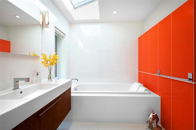
Small bathroom in white and orange.
Small bathroom with orange accessories.
Stylish bathroom with decorative orange tiles.
Designers at Habitat Architecture completed the interior of a small industrial-style bathroom with shower curtains and bright orange-colored towels.
Orange in an industrial bathroom.
Black and white bathroom with orange accents.
Color combinations in the design of the bathroom
- For a small bathroom, it is best to choose light colors for the floor, walls and ceiling. Light color will visually make the bathroom larger, the interior will become lighter, more spacious and airy. The main thing during interior design is to observe the measure in everything, since a large number of pastel colors in the interior makes it boring. An accent wall and small decorative elements will help to avoid this.
- A more familiar and frequently used design option is a dark shade of the floor and light walls. This design is already considered a classic. Thanks to this combination of dark and light, the room looks visually larger. Such contracts of shades make the interior of the bathroom very stylish, spectacular and original.
- The bathroom, which has windows, is a rather narrow space, but high ceilings will look great if you make the ceiling and floor light, and make the walls dark. This solution will visually expand the room and slightly reduce the height of the ceilings. When choosing a shade for the walls, you need to weigh the pros and cons, as overly dark shades will make the bathroom gloomy. This design is perfect for a bathroom with a window. If there is no window, then one accent wall will save from the gloomy, which will be decorated in a light color. With the right selection of all shades, the interior of the bathroom will turn out to be incredibly beautiful, interesting and original.
- A very bold decision is to design the floor and walls in dark shades, and the ceiling in light ones. Not everyone is ready for such a design of the bathroom. If you go too far with dark and shades, then something similar to the basement will come out of the bathroom.This design is suitable for those who want to design a bathroom in a loft style.
Therefore, before choosing a color for the floor, walls and ceiling, it is necessary to determine what kind of effect is expected from the selected combinations of shades. How will the bathroom look in this design, will the interior be overloaded, which will lead not to relaxation, but, on the contrary, to tension. The bathroom is the place where you want to feel comfortable, but due to the wrong combination of shades in the design, the interior can lead to a constant feeling of discomfort. This is absolutely unacceptable!
If there are doubts about the chosen design option or if there are no design ideas for the bathroom, then it is best to contact a professional designer who will help you design the bathroom in such a way that it will be very stylish, comfortable and original, while taking into account the tastes and preferences of the owners. apartments.
Possible color combinations are the secret of designers
Designers have one secret that allows them to always choose the right combinations of colors and shades, whether it's a bathroom or any other interior for painting - this is the so-called Johansen Itten circle. To work with it, it is enough to know four simple formulas.
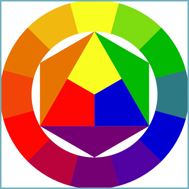
Johansen Itten circle for choosing matching colors
- The two most compatible colors are located opposite each other (for example: blue and orange).
- Three color classic. Choose colors that are at an equal distance from each other (for example: blue, red and yellow).
- analog triad. Choose any 3 shades located side by side (for example: yellow-orange, yellow and yellow-green).
- Contrasting triad. One color will be the main one, and two shades are added to it, which are adjacent to the opposite (for example: the main purple, and additional ones: yellow-orange and yellow-green).
The color of the walls in the interior of the bathroom photo
It has long been no secret to anyone that colors can affect our mood and even well-being. And from what color you choose for finishing the bathroom, it will depend on what emotions, sensations and mood your whole day will be filled with. You ask: why ALL day? Because the first room we go to after sleep is this.
There has always been a fashion for certain colors for finishing the bath. In Soviet times, it was white and blue. Then came the time for black bathtubs and toilets. Today we are more relaxed about the choice of shades, but still do not forget about the compatibility of colors.
So, what is the meaning of different colors? Psychologists usually divide colors into active and passive. Active ones are exciting, while passive ones calm and pacify.
Of course, you should not refuse the presence of white in the bathroom. We always associate it with cleanliness and order. When there is little white in the room, associations appear associated with openness and lightness. And when the white color dominates, it begins to evoke negative associations (remember the surgical room, staff gowns, bandages and cotton wool).
Next to white, blue and blue colors can coexist, because. they create a feeling of coolness. The blue-blue scale is traditional for the bathroom. It is associated with freshness and purity and often finds support in decor motifs - boats, starfish, fish. Blue is associated with water and ice, so it has a calming and cooling effect. In addition, it visually enlarges the space.
Pink also goes well with white. It symbolizes romance, kindness, love, therefore it causes a feeling of comfort, calms, and helps to reduce aggression. Light shades of purple sets in a romantic mood.
Yellow is a favorite color in home interiors. It fills any room with warmth and light.This color activates the intellect because it promotes concentration. Pale yellow and apricot shades look very harmonious in the bathroom. Orange color promotes the rise of enthusiasm, inspiration and mood. He constantly keeps in good shape, stimulates creative activity. However, it is desirable to use it in the interior of the bathroom only in detail.
All shades of green are also suitable for the bathroom. Green, as the most natural color, evokes a feeling of stability and peace. It calms the psyche and helps to concentrate and make a decision. The coldest of all shades of green - turquoise - is used to create a cool effect. Light green color looks especially good in rooms where there is a lot of natural sunlight.
Red is the dominant color that is exciting. A large amount of red quickly tires.
Various shades of brown create coziness and harmonize well in combination with other shades of warm tones.
Gray color and its shades can fit well into the interior of the bathroom, as it calms the nerves.
Black color in large quantities suppresses, makes a depressing impression. Combinations of black (dark purple) and white are suitable for sterile white plumbing.