So, the issue of repair was on the agenda. It does not matter whether we are talking about a newly purchased apartment in a new building or updating the interior of a family nest that has become boring over the years. How to make your home cozy and comfortable? What color to paint the walls of the apartment? Is it worth choosing the same color scheme for all rooms or is it better to diversify the design of the rooms as much as possible? Let's try to answer these questions.

Options for color compositions
The idea of a common color scheme in an apartment does not require the use of only one color in all rooms. Color solutions for decoration can be:
- monophonic (one main color, combined with several of its shades);
- polar (using only two contrasting tones);
- two-color (two well-matched colors are used);
- multicolor (a combination of three or more colors).
The whole point of a single color scheme is not to limit the number of shades used, but that in each room the selected combination is duplicated at least approximately.
Let's look at examples:
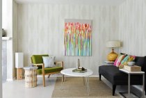
- If you choose one specific color, such as green, each room will be decorated in shades of green, and in one room the walls can be olive, in another - light green, in the third - emerald.

- With a polar range, for example, with a combination of blue and yellow, the selected combination is used in each room. For example, walls in all rooms can be painted yellow, while decor items and furniture are selected in blue shades. It will be interesting if one room is blue with yellow elements, and the second is yellow with blue accessories.

- A two-color or multi-color color scheme in this case is not the use of different colors in the rooms, but the repetition of a certain combination in each room. For example, you like the combination of brown, green and white. Then this color scheme will be traced in the kitchen, and in the bedroom, and in the living room.

When painting walls or wallpapering in rooms for recreation or mental work, it is better to choose color schemes without sharp contrasts and variegation.
Features of different colors
When deciding what color to paint the walls in, you should think about the psychological characteristics of colors, as well as their "behavior" in the interior.
- Black is not usually used as the main color, but can become part of the overall color scheme. It goes well with mirror and glossy surfaces, but at the same time absorbs light and narrows the space around.
- Gray is neutral. Well suited as a backdrop for expensive furnishings. The gray color in the interior is suitable for those who often change the look of the premises. It is easy to pick up interior items of other shades for it, but with an illiterate approach, it can look gloomy and boring.

If the walls of the apartment are painted in one neutral discreet color, to change the color scheme of the interior it will be enough to change the accessories: curtains, paintings on the walls, furniture upholstery, sofa cushions.
- White color in the interior enjoys increased attention of designers. Associated with the sun, purity. Indispensable for small spaces that need to be visually enlarged. White color in the interior has only one drawback - increased pollution.

- Red color has many shades, the correct selection of which allows you to effectively decorate the living room or kitchen. For example, the coral color in the interior unambiguously screams about luxury and wealth, cold shades of red give the room comfort.However, you need to remember that it quickly causes fatigue, makes the situation heavier, so using red as the main color of the apartment is not the best solution.

- Yellow and orange colors have a positive effect on a person. Ideal for children's rooms and rooms facing north. They may well become the basis of the overall range.

- Blue is a very popular color among designers when it comes to painting bedroom walls. It has a relaxing effect, creates the illusion of peace, but it is worth considering whether it is worth making the whole apartment blue. Light blue shades are used to visually expand small spaces.

- One of the most controversial colors in the range is purple. It has many shades, each of which has a different effect on the human psyche. The lilac shade with long exposure reduces activity, depresses. Violet color in the interior of the living room is used quite rarely, because it visually reduces the space and contributes to fatigue. If you love purple, use it in combination with other colors like white or green.

- Brown color, in particular its dark shades, also visually narrows the room. But unlike purple or lilac, designers often use brown for their ideas. It creates an even and unfussy mood, soothes, goes well with most colors.

- Green color helps to concentrate, has a positive effect on performance. Painting the entire apartment in different shades of green can be considered a perfectly acceptable option.

If you find it difficult to choose a color or are afraid that the chosen shade will quickly get bored, stop at white or beige. White color in the interior is universal.
Style features of color design
Each direction in interior design tends to use certain shades of color.
- Classicism tends to light pastel colors.
- Selection of shades for retro and pop art allows any contrasts. The most incredible combinations are possible: pink and green, purple and orange.
- Minimalism implies a light scale with the use of white, gray and black tones, symbolizing restraint and conciseness.
- Modern - a range of brown and golden shades with a transition into each other. Combinations of cream and cream colors are also possible.
- Mediterranean style - a selection of shades of green, (pistachio, emerald, olive), white, blue, blue, amber and terracotta.

Rules for choosing a common color scheme for decorating an apartment
When choosing a color scheme, it is worth considering the following nuances:
- It is necessary to select the general color plan of the apartment, taking into account its light orientation and natural light. If most of the windows face south and east, cold tones will do. In rooms located on the north side, it is better to use the warm part of the color scheme.
Warm tones create comfort and coziness in the room, cold tones demonstrate restraint and respectability.
- The general rule for interior design is that the darkest shades of the base color should be at the bottom, the lighter ones should be at eye level. The lightest ones are under the ceiling, which is done in neutral colors.
- A very popular option is to paint one wall of the room in more saturated colors, and the rest in calm and muted ones.
If the goal is to focus attention on certain pieces of furniture (for example, paintings, tapestries, antique furniture), it is worth choosing more restrained tones for the walls.
- The selection of flooring, doors and accessories directly depends on the selected single color scheme.A light floor covering will be in harmony with almost any shades in the interior of the room, which cannot be said about the field in brown or black tones. A win-win option for doors is white or any shade that matches the color of the walls.

When making the final decision, it is worth double-checking everything again, taking into account all the subtleties of the future situation. The chosen idea should clearly demonstrate the harmony in the room and profitably adjust its volume and area. The chosen color scheme will clearly speak about the individuality of the owner of the property, reveal its essence to future guests, declare tastes and habits.