A bedroom is a room designed for rest and relaxation, restful sleep and recuperation, so every nuance needs to be thought through for interior design. When deciding which wallpaper is better to glue in the bedroom, you need to take into account all the factors: the material of manufacture, texture, color, pattern type, compatibility with other interior elements.

Types of wallpaper according to the material of manufacture
For the bedroom, it is desirable to choose canvases from environmentally friendly, breathable natural materials. Important parameters are strength, durability, resistance to fading.
paper wallpaper
The most economical type of decoration for the bedroom. They are distinguished by good performance characteristics, environmental friendliness, breathability, but they do not withstand high humidity, mechanical damage and quickly fade in the sun.

Non-woven wallpaper
Such canvases made from cellulose fibers have the properties necessary for decorating the walls in the bedroom:
- environmental friendliness;
- abrasion resistance;
- breathability;
- durability.
Non-woven wallpaper perfectly masks the unevenness of the walls, with the exception of especially large cracks and bulges, does not tear when the house shrinks, and can be easily removed if necessary. Wallpaper for painting withstand multi-layer staining.

Fabric or textile wallpaper
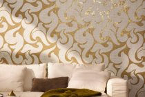
Textile fabrics, which are fabric glued to a paper or non-woven base, look especially advantageous in the bedroom interior. In the manufacture of such wallpapers, silk, chintz, brocade, velor, velvet, jute, linen, and felt are used. This causes their high cost. Finishing the bedroom with textiles brings sophistication and aristocratic gloss to the design, and impregnation with compositions that prevent fading and dust settling greatly simplifies the care of surfaces.

Vinyl wallpapers
Cloths, which are a layer of polyvinyl chloride applied to a paper or non-woven base. Differ:
- variety of colors and designs;
- durability;
- high performance - they can be washed with any detergent.

The disadvantage of such wallpaper is airtightness, which limits the scope of their application. It is not recommended to completely paste over the bedroom with them, however, you can use vinyl wallpaper in combination with other materials to decorate one wall or a fragment of a room when zoning.
For complete or partial decoration of the walls of the bedroom, you can use glass wall paper, liquid wallpaper.
What shades to choose for the bedroom
The quality of rest and good sleep depend on color perception. In the bedroom, it is better not to use rich warm or cold tones that attract attention, excite the nerve centers and interfere with relaxation. It is advisable to focus on soft undertones and shades that have a beneficial effect on the psyche and do not irritate the eyesight.
In small rooms in Khrushchev, light colors are especially relevant, soothing and relaxing - cream, beige, soft green, turquoise, coffee with milk, smoky gray.
White
Shades of this color visually increase the space, bring a touch of freshness and purity. White is combined with all tones, so getting rid of the feeling of sterility is easy: just add bright accents.

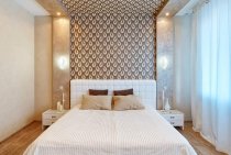
Beige
A warmer and more relaxing color, as well as white, able to "push" the walls. Shades of beige look great in combination with coral, smoky blue, light green, turquoise, lilac. Wallpaper in cream tones is in harmony with light furniture, floors finished in light brown shades, milky white ceiling.

Grey
Dangerous with the wrong shade of color.When overabundance can cause despondency, apathy. However, in combination with other tones, such as pearl, silver, blue, it looks sophisticated and noble.
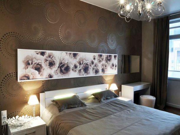
Brown
Chocolate-colored wallpapers bring a touch of calm and tranquility to the bedroom interior, especially in combination with light beige, white, pale blue or light green shades.
In a small room, it is better to accent a fragment of the wall with a rich brown finish.
Yellow
This color is suitable for a cold northern bedroom, it will give cheerfulness on a cloudy morning. The main thing is not to choose flashy yellow, focusing on calm shades. It harmonizes well with green, blue, brown, orange, golden.

Orange
A bright color is not suitable for a bedroom, but more delicate, diluted apricot shades will “warm up” a room with windows to the north. Not the best choice for a small space, as a warm bright color narrows the space.

Orange in the orange version can be used as accents.
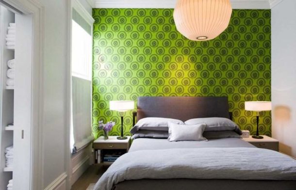
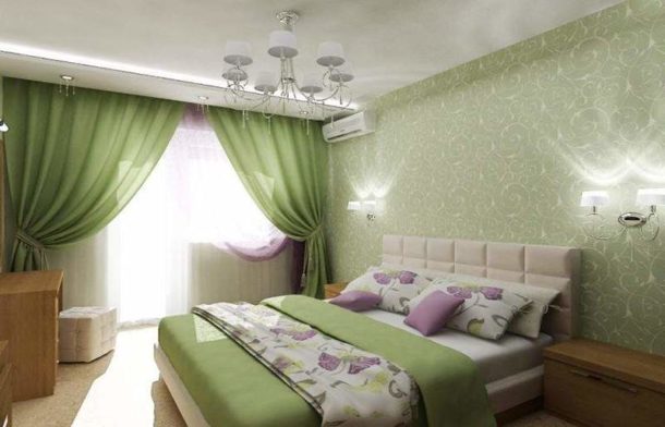
Green
This color soothes, refreshes, relieves stress, relaxes. The variety of shades, from light green to malachite, allows you to experiment with finishing. Best combined with natural tones - brown, yellow, blue.
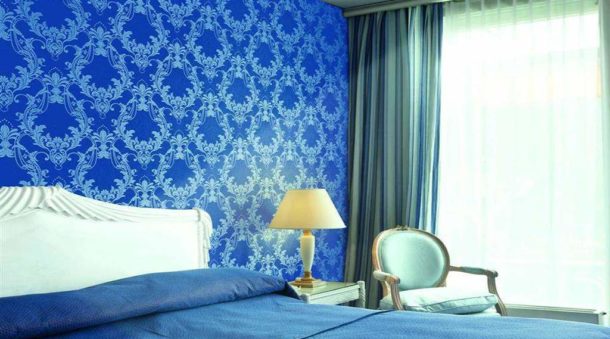
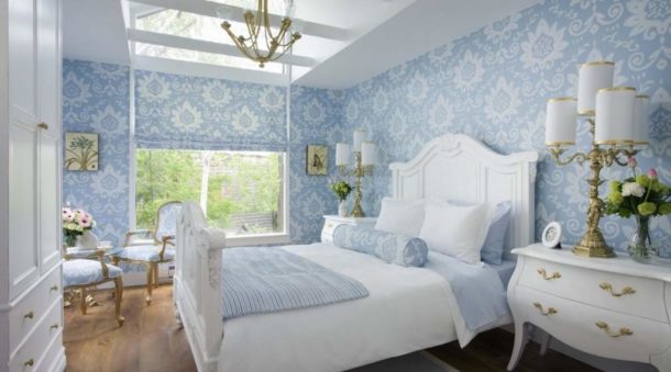
Blue
Deep color makes the interior strict, looks great with white, silver, but can put pressure on the psyche. Pale blue and azure shades are better suited for the bedroom.
Red
Too annoying color, use it in the bedroom with great care. However, boron shades are still acceptable. They will create a rich, elite interior. The main thing is not to combine them with other colors, except for gold and black.

Pink
Quite another thing is pink, which creates a romantic mood, a cheerful, pleasant atmosphere. In addition, this color helps to wake up in the morning, energizes, activates vital energy. It goes well with white, gray, pistachio, beige, wenge.

Purple
Calm gentle color that creates an atmosphere of mystery. It is a shade of purple, but, unlike it, it has softness and warmth. It goes well with white, beige, milky, blue, purple, light green. Suitable for sensitive subtle natures, but for some people it can cause anxiety.

Important! Do not blindly follow the advice of interior designers. Color combinations that are quite harmonious from the point of view of specialists sometimes cause rejection, reaching the point of irritation. The choice of the main tone and shades of wallpaper for finishing the bedroom is an individual decision.
Recommendations for choosing colors by cardinal points
When choosing a wallpaper color palette for the bedroom, it would be wise to focus on the cardinal points and the degree of illumination of the room.
North
If the windows face north, northwest, northeast, it is better to give preference to warm warming shades:
- light pink,
- beige
- sand,
- peach,
- golden,
- tea rose.

By adding light and warmth, they have a beneficial effect on the psyche and relieve stress.
If photo wallpapers are used, it is better to choose a calm summer landscape, a forest lit by the sun, a waterfall in tropical greenery.
South
Cold shades of wallpaper will be appropriate here:
- sky blue,
- pearl gray,
- soft green,
- pale lilac,
- silver,
- snow-white.
Cool, fresh colors soothe and reduce tension in the bedroom, located on the warm south side, help you fall asleep faster.

West
For a bedroom lit by the evening sun, tones that promote relaxation and comfort are suitable. Suitable soft shades of the following colors:
- red,
- pink,
- beige,
- chocolate.

East
The bedroom is brightly lit by the sun even at dawn, which contributes to a quick awakening in an excellent mood.It gets dark early in the evenings and creates a special relaxing atmosphere. An excellent solution is the wallpaper of the following tones:
- light green,
- turquoise,
- blue,
- smoky gray
- silvery.

They will go well with mountain and sea landscapes, jungle at sunset, images of the underwater world on photo wallpapers.
feng shui colors
Interestingly, according to Feng Shui, the predominant colors in the room should be different. From the point of view of Eastern teaching, they must correspond to the elements.
- Southwest, northeast - the colors of the elements of the earth. Brown, beige, golden.
- South - fiery colors. Red, orange, pink.
- West, northwest - the element of metal. Silver, white, grey.
- North is the element of water. Shades of blue.
- East and southeast - tree. All shades of green.

As you can see, the cold blue color is recommended to be used in the northern room, which will make it even colder and darker, the “hot” red color in the southern one, where, on the contrary, you want coolness. Therefore, blindly follow these recommendations is not necessary.
Perhaps it is worth finding a compromise between the opinions of adherents of Eastern teachings, psychologists and designers. They all agree with each other on one thing: calm, muted, soothing shades are suitable for the bedroom, there should not be too many different colors.
Which drawing to choose
When choosing wallpaper with a pattern, you need to consider:
- room size;
- location relative to the cardinal points;
- natural light.
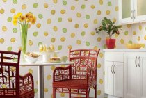
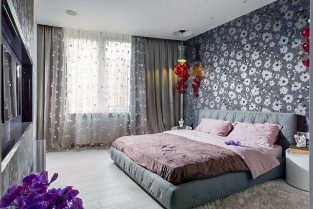
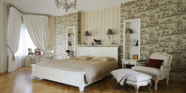
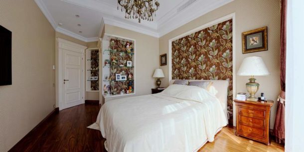
One of the most popular types of images on the wallpaper is a floral print, typical for interior design in oriental, English, Scandinavian, Provencal, rustic styles.
- In a spacious, well-lit bedroom, a large floral print on a light background looks great. For a small room, it is better to choose a medium-sized pattern, since excessively small details of the pattern, scattered in abundance on the walls, irritate the eyesight and get on the nerves.

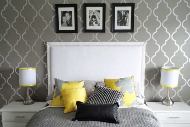
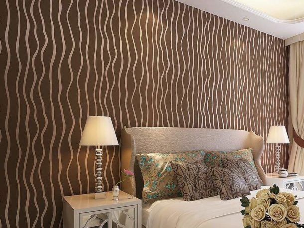
- The vertical geometric pattern increases the height of the room, the horizontal one contributes to the visual expansion of the space. The vertical and horizontal stripes also change the geometry of the room.

- Large leaves, intertwining branches, leafy ornament soothe and promote quick falling asleep. Floral drawings have a beneficial effect on the psyche.

Wallpaper combination
Plain wallpaper in the bedroom goes well with similar canvases of a different color and patterned material. Wall decoration in shades of one primary color with accents on certain fragments is extremely popular. Consider the most common combination finish options.
Vertical arrangement
It performs the function of zoning and is characterized by the insertion of a strip of wallpaper with a floral print, ornament, pattern or plain.
- If the wall is decorated with wallpaper with a pattern, the insert should be plain, but of the same shade.
- With a one-color design of the wall, a strip with a pattern is inserted, strictly sustained in the colors of the base finish.

Horizontal combination
Here the same principle of zoning the room is performed, only the stripes are arranged horizontally.

inserts
In the vertical or horizontal direction, fragments of plain wallpaper or canvases with a pattern of a different shade are pasted.
It is important to adhere to the same principle as with a vertical or horizontal arrangement: an insert with a pattern is superimposed on a plain background, and without a pattern on a motley background.

Niche design
Pasting niches with lighter or darker wallpapers is an extremely effective technique. When placing a recess in the wall on the unlit side, light shades of the base color should be used, and dark ones on the sunny side.
- With a monophonic wall decoration, you can decorate a niche with plain canvases and wallpaper with a pattern.
- If canvases with patterns or floral prints were used as the basic design of the walls, the niche must be pasted over with only plain material.
Bedroom interior design is a complex and exciting process that requires attention and concentration. It is important not to overdo it with the shades, texture and texture of the wallpaper. It is advisable to limit yourself to one base color, do not use more than three shades and do not overload the room with unnecessary details.